Workflow
Productivity App
Workflow is a productivity app for individuals. View and manage all
your tasks in one place.
Role: Sole designer on a team of 4
tools:
figma
Problem
Professionals and students have to keep track of multiple platforms to plan what needs to be done, by when. They may use a calendar for scheduling, agenda or to-do list for personal tasks, project management tool for team coordination, and notes app to capture their thoughts. With all the context switching and cross updating, more time is spent planning how to work than getting the work done.
Goal
Boost productivity and free more time for individuals by reducing the time and effort it takes to manage work.
Primary KPI: Total amount of time spent on project management
tools per user per day
Secondary KPIs: Median number of integrations per user,
median number of active workspaces per user
Target Users
The target users are working professionals and students. Professionals and students work in both personal and team contexts, often requiring the use of multiple tools. A software developer, for example, often switches between multiple tools to manage their work, such as Github to track issues, the team’s project management tool to view assigned tasks, and their personal notes or to-do list.
Competitive Analysis
Notion
Strengths
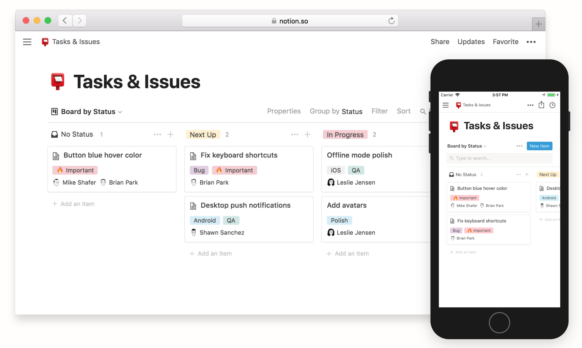
• Combines project management tools with notes and team knowledge base
• Organize tasks and notes into workspaces
Limitations
• Supports only one way integrations (importing data)
• No integrations with education platforms
Asana
Strengths
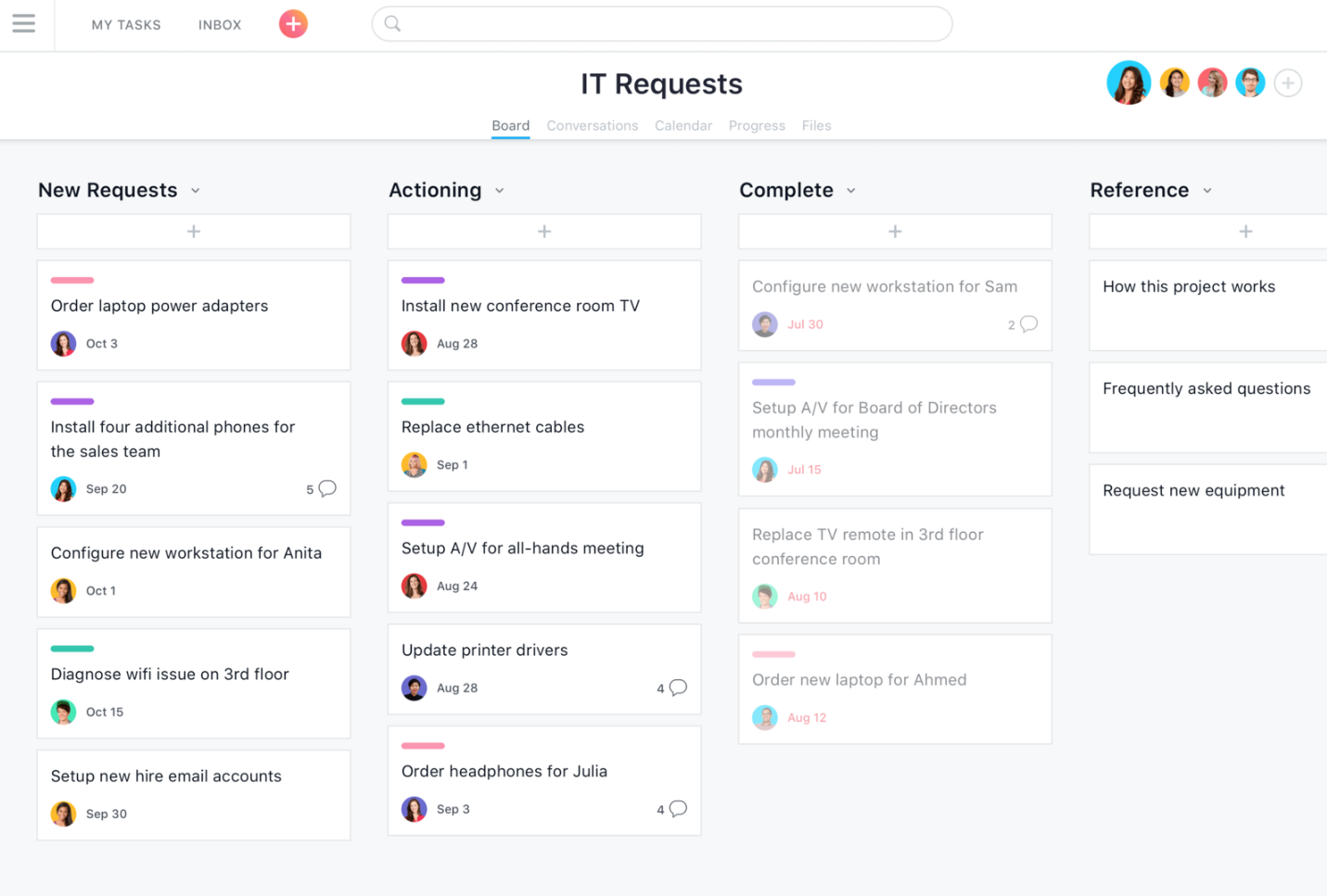
• Over 100 integrations with productivity apps
• Feature packed for work management
Limitations
• Geared towards teams—users must first create a team workspace
before creating projects/tasks
• No integrations with education platforms
Research
Interviews
To scope the problem, the team and I conducted interviews with fellow coworkers and classmates, with the goal of understanding their daily workflows including the current set of tools they use for task tracking in teams, and their experiences with personal productivity apps. Some of the questions we asked were:
• What tool or app does your team use for project management? What
is your opinion of it?
• Could you see yourself using this app to track personal tasks?
Why or why not?
• How do you keep track of your personal tasks and to-dos? What
do you like about it?
• Have you used other personal productivity apps in the past? What
was your experience with it and what caused you to switch away?
From these interviews, we created a list of pain points and takeaways that would help shape the future designs.
Pain Points
• It takes too much effort and time to update productivity tools
• When there are many unfinished tasks or no clear roadmap, it is
difficult to prioritize and choose what to start working on (common at
the early stage of projects and especially for students)
Takeaways
• Tools used for team project management (Asana, Github, Trello)
are often not viable or too complex for personal task tracking
• Task tracking and notes are two important needs in daily work
Design Requirements and HMWs
Projects and tasks have different scopes and requirements. For example, a task to add a new feature to an app would have a much larger scope and timeline than a personal task such as buying groceries. The app must be able to account for this by allowing multiple project management methods.
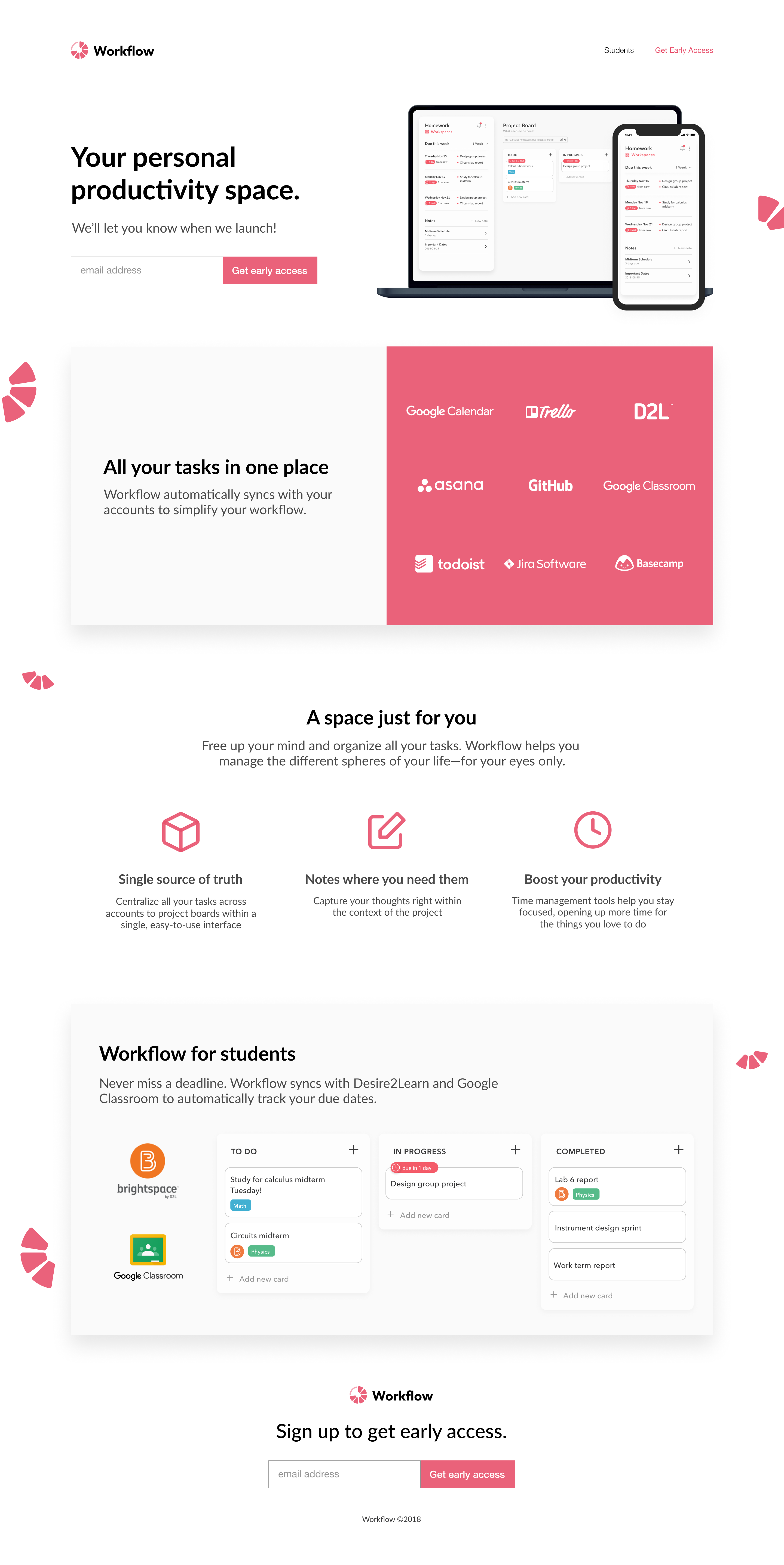
The app should be a single source of truth for all the tasks that the user is responsible for. To accomplish this, the app must support integrations with project management tools used by teams such as Trello and Asana. For students, this means that the app must sync with popular education platforms, such as Google Classroom or Brightspace by D2L.
Work management tools take effort and time to maintain.
How might we reduce the effort required to update project boards and to-do lists?
Long lists of tasks can feel overwhelming and discourage users from
choosing one to start.
How might we help users prioritize tasks?
Wireframes
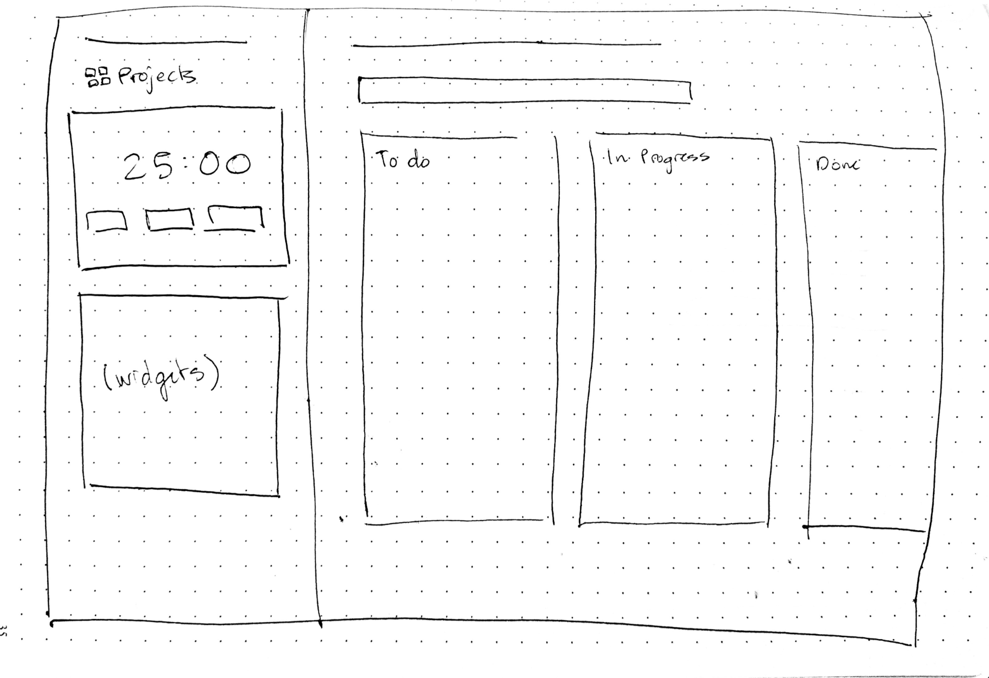
Option 1
Design Features
• Kanban style task management
• Sidebar allows for widgets like the pomodoro timer shown, or a calendar view
• Sidebar is modular and customizable
Limitations
• Introduces complexity in setup
• Less space available for kanban board task management
• Sidebar could be a space dedicated to the most important actions and information
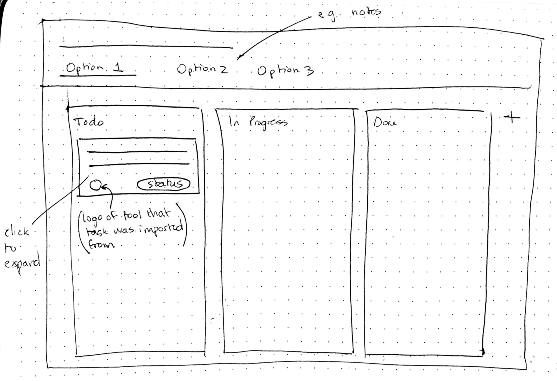
Option 2
Design Features
• Tab navigation allows for full width space for task management and notes
Limitations
• Key actions and information are hidden behind navigation items
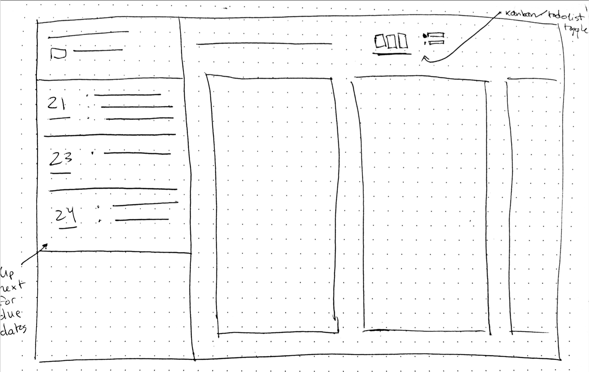
Option 3
Design Features
• Due dates easily visible in the sidebar, helping with task prioritization
Limitations
• While the toggle helps users find the task management method that
works best for the project, it is not an action that would be frequently
used and can instead be moved to the project creation flow
Design Option 1
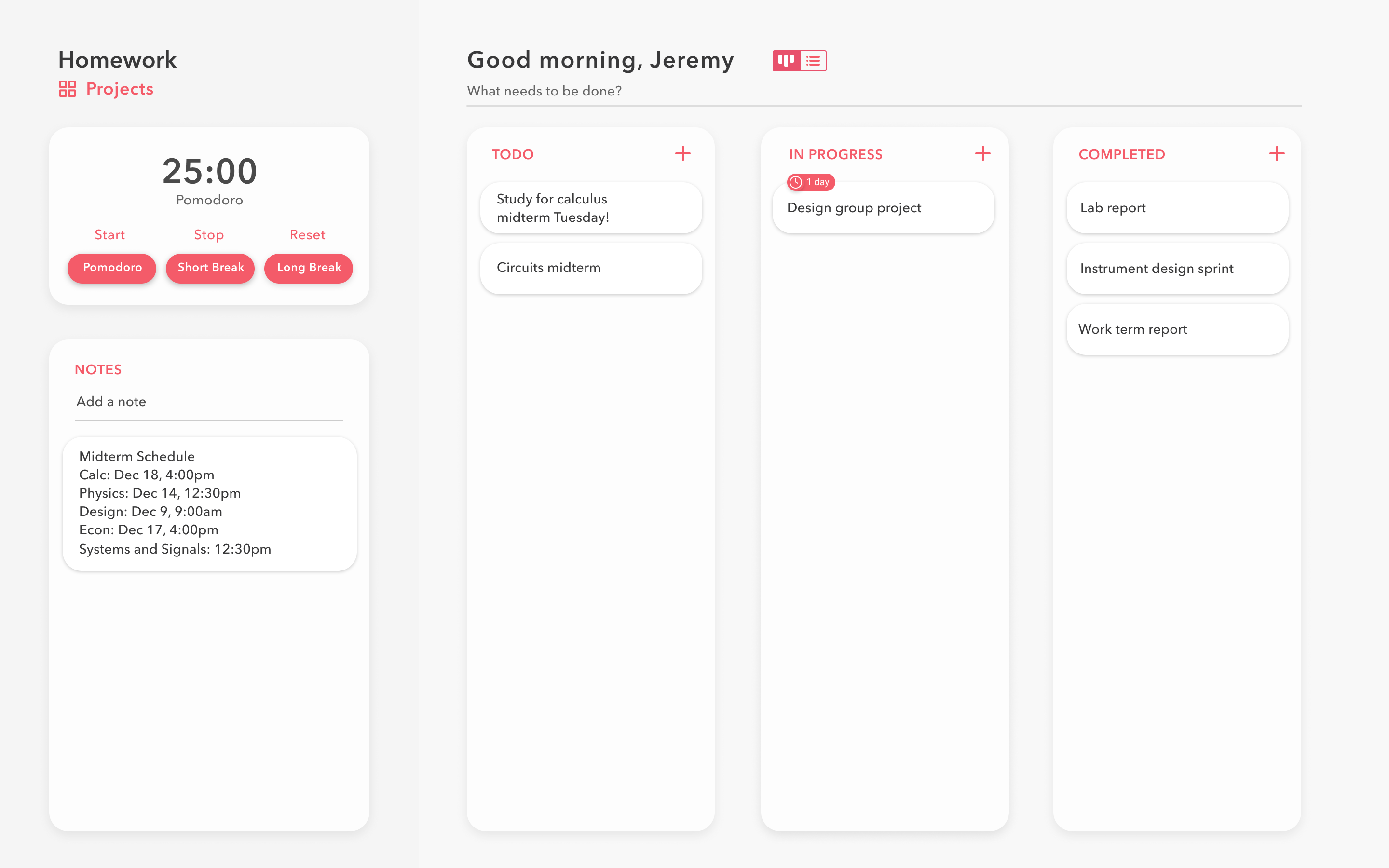
For this early iteration, I explored using customizable widgets in the sidebar, with the pomodoro timer and notes as examples. While the modular sidebar allows for customization, it would potentially detract from the experience as more setup would be required. A feature such as notes also needs far more space than the widgets allow for. These considerations led to the next iterations below.
Design Option 2
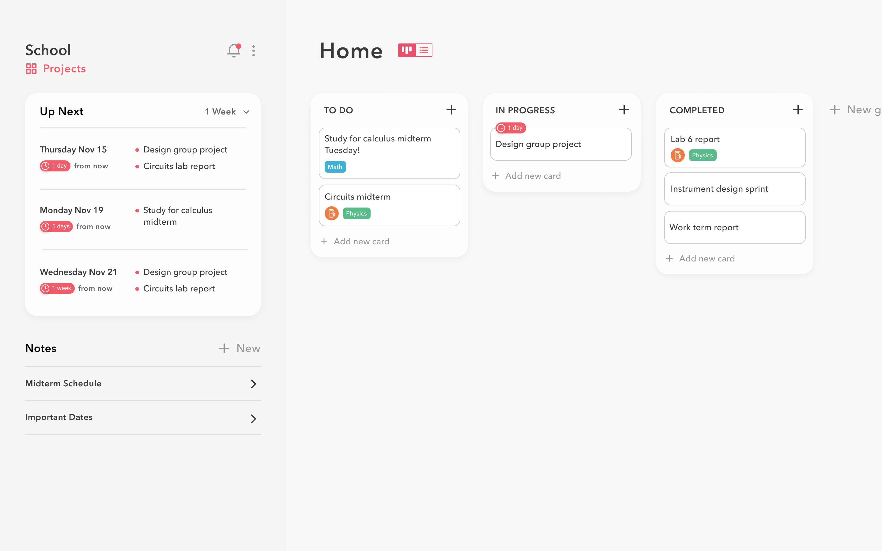
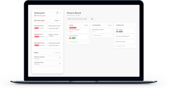
This second option introduces a calendar component showing upcoming due dates to help users with task prioritization. When tasks in this calendar component are hovered, the corresponding card in the kanban board should lift off the screen with a subtle animation. The red pills signify the amount of time left before a task is due, while the colored tags for tasks represent the category that the task belongs to. The logo in certain tasks indicates that it was synced/imported from an external platform. I also designed the sidebar to include a dedicated notes section, following after familiar note-taking desktop apps such as Apple Notes and Evernote.
Design Option 3
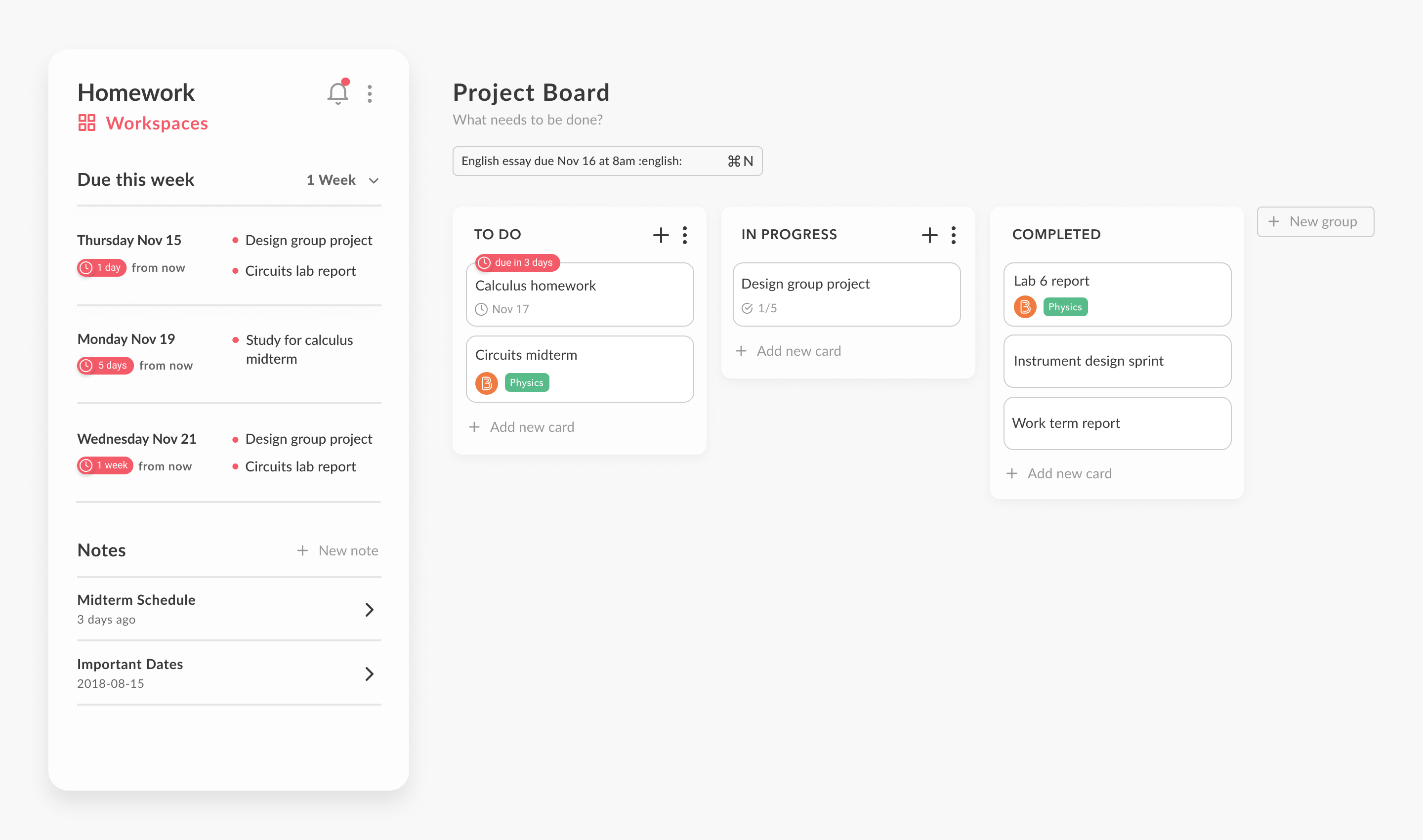
For the latest iteration, I designed the sidebar as a floating card to increase contrast with the background and more clearly distinguish it from the main content on the screen. As one of the pain points from the user interviews was that task tracking tools are time-consuming to update, I explored potential ways to make using the tool as effortless as possible. Through the input field below “Project Board”, users can quickly create new tasks complete with tags and due dates simply by entering prompts similar to the placeholder text (“English essay due Nov 16 :english:”).
Prototype
View the prototype here.
Landing Page
