Shopify
Redesigning the Frenzy product page
I redesigned the product page of Shopify's flash sale app Frenzy,
with the goal of increasing conversion and checkout rates in the Frenzy app.
Role: Sole designer and front-end developer
tools:
sketch
principle
Background
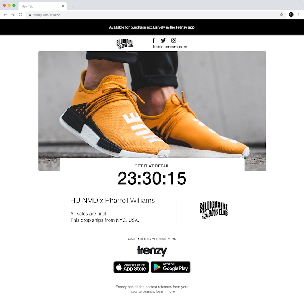
Frenzy is a mobile app from Shopify that powers flashsales for high heat products in the streetwear industry, such as sneakers and apparel. My role on the team was being both the product designer and front end developer for the redesign of the Frenzy product page.
Problem
To define and scope the problem of the current product page, I collected feedback from the brands on the platform, first time buyers, and fellow team members. I learned that buyers lose trust in Frenzy as the current page does not provide crucial information about a sale, and that the page lacks the visual identity to fit the industry. I grouped the main points from this disovery phase into three categories to better scope the problem.
Buyer
Interested buyers are not shown important information about a sale, such as dropzone location and sale price.
Merchant
Merchants want to convert their followers into buyers, but the current page lacks the excitement and urgency needed to drive app downloads. The visual design of the existing page is very barebones and is not catered to the target audience of the product.
Shopify
The product page lacks the branding and design language of the Frenzy product. Important information about each sale is missing, potentially misleading users. This shows the Shopify brand in a negative light and damages trust in Frenzy users.
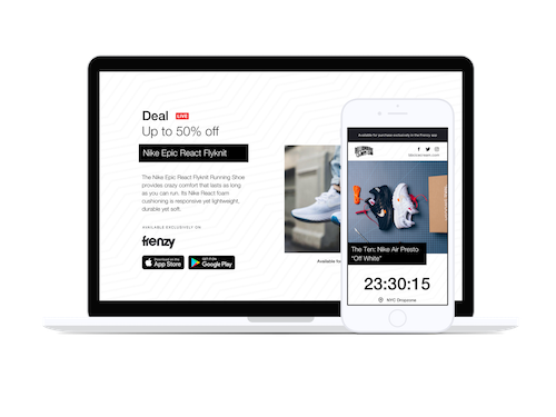
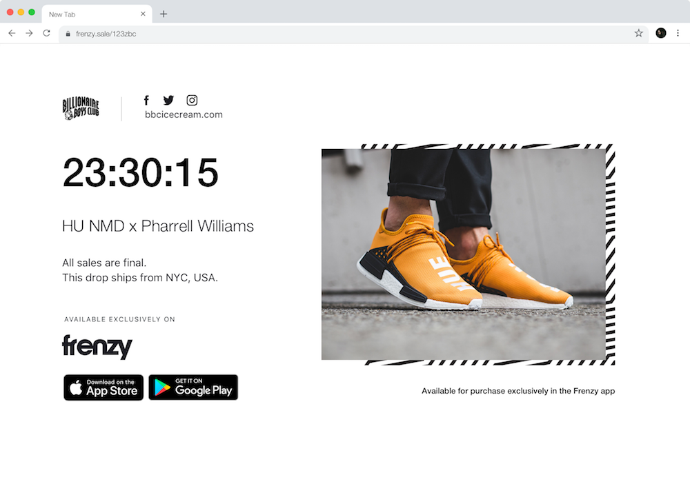
Current State
Goal
Increase conversion rates and app downloads by engaging first-time/repeat visitors and showing all important information.
Primary KPI: Increased rate of conversion to Frenzy app (number of download button clicks relative to new page visits).
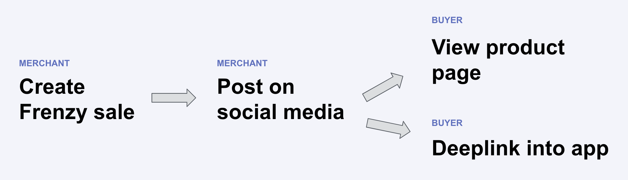
Core Flows
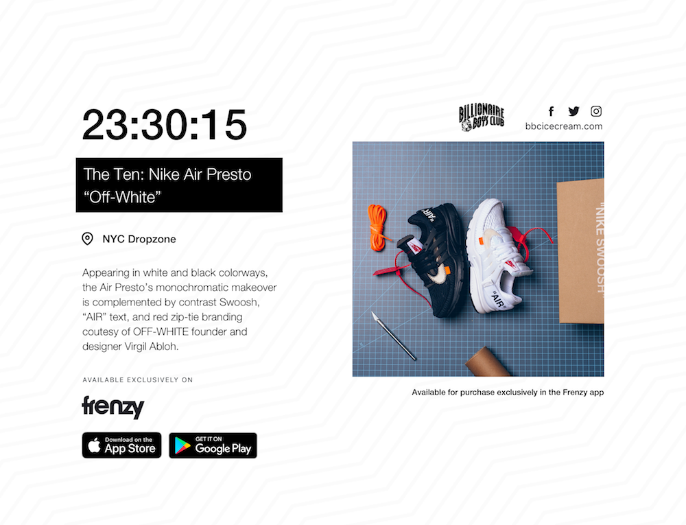
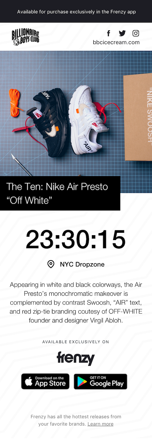
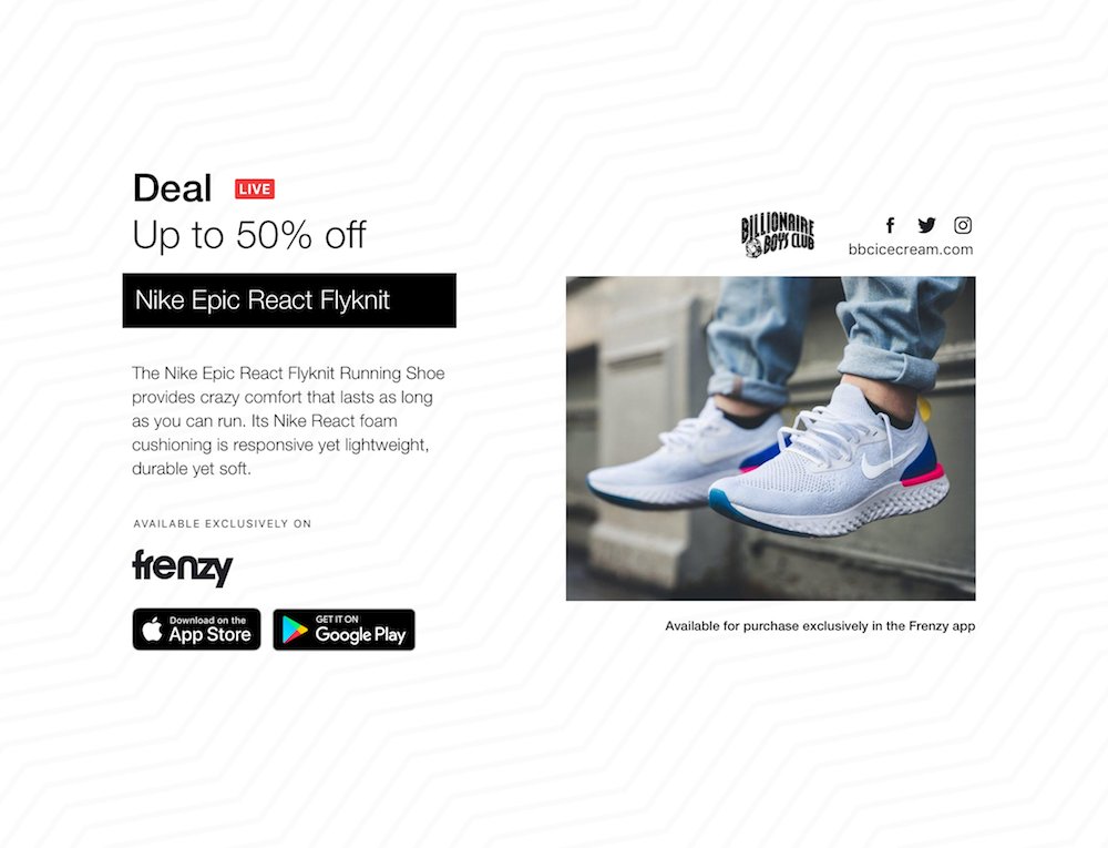
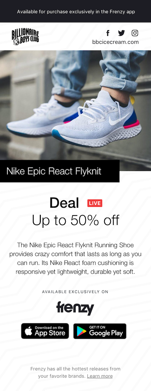
Sneaker and streetwear brands use Frenzy by first creating a Frenzy sale through their Shopify account. After the sale has been approved, the link to the product page for their sale is provided, and the merchant shares this link through social media. If the user has the Frenzy app installed, the page directly takes them to the product inside Frenzy. On the other hand, those without the app installed see the product page, designed to be a preview of the product that leads users to the app. For this reason, the product page is very important for brands wishing to convert followers into buyers.
Wireframes
Ideating with early sketches
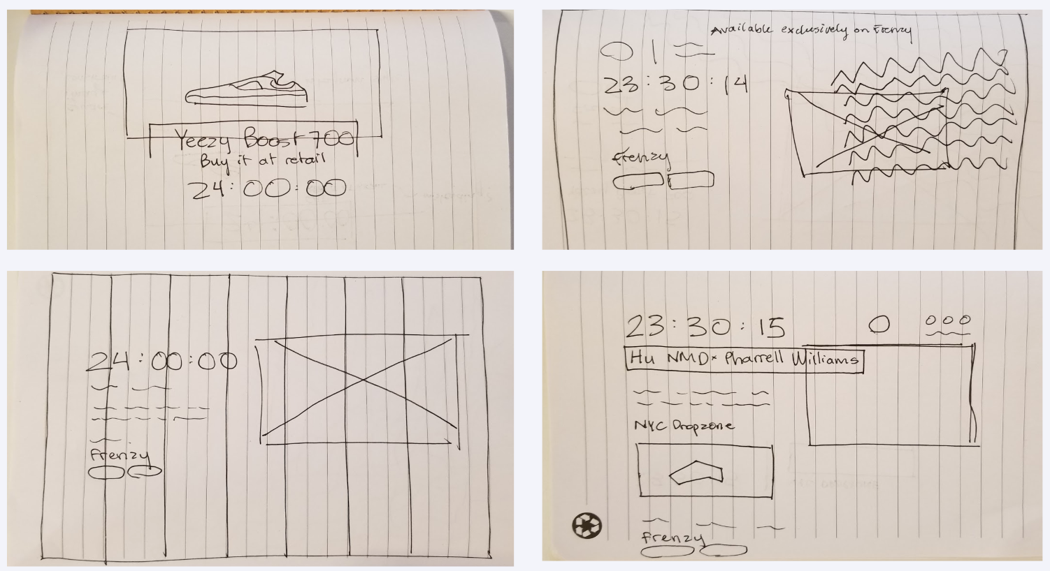
From my initial sketching, I narrowed the design options down to three main concepts. The first (top left) takes advantage of a large hero image used to capture the user's attention. As merchants choose the best photos to showcase their products, highlighting the product image was an important consideration during the design process. The second design option (top right) focused on emphasizing Frenzy branding with its wavy line pattern, creating strong visual ties with the page and the mobile app. Finally, the third option (bottom left and bottom right) focused on balancing emphasizing the value proposition of the Frenzy app with the branding and content of the merchant. In the end, elements of all of these wireframes were used to create the final designs.
Design Options
Option 1

Pros:
• Hero image captures the user's attention
• Fully responsive
Cons:
• Desktop site not easily scalable (dropzone sale or long description)
Option 2
Pros:
• Strong Frenzy branding
Cons:
• Distracts from product image and CTA
Option 3


Pros:
• Draws attention to countdown and product name
• Subtle background elements for branding and visuals
Cons:
• Slight differences between desktop and mobile
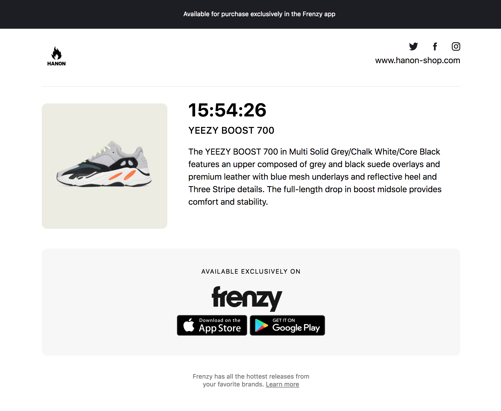
Final Designs
View all final designs here.