Focus
Simplify your workflow | focustodo.io
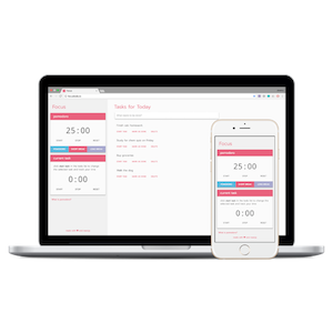
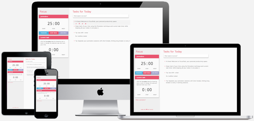
Focus is a study tool application designed to improve the user's productivity by providing time tracking tools along with a todo list. The app uses a pomodoro timer to assist the user in managing time, and also includes a stopwatch to keep track of the time spent on each task.
tools:
sketch
figma
react
The Problem
Users need an easy to use, all-in-one productivity tool
Workflow can be a complicated process. Whether a student or working professional, time management and keeping track of daily tasks are both essential components to a productive day. Todo lists are great, but how how much time should be allocated to each entry? Pomodoro timers help to improve work efficiency, but what tasks should be prioritized in each session?
The Goal
Design an intuitive application to manage time and todos
Centralizing both time management tools and todo lists in one application simplifies the user's workflow, improving their productivity.
User Research
Creating empathy in the design process
Early in the design process, I surveyed friends and peers on their work habits and use of digital productivity tools, gathering responses from both students and young professionals. Though the sample size was small, I found that the greatest challenge users face is time management. Another key insight of the study was that nearly all users keep track of todos, whether in planner notebooks, mobile applications, or calendars.
To further explore this idea, I interviewed users who currently use digital productivity tools such as mobile todo applications. One of the most important takeaways from the user study came as I interviewed my good friend, as he mentioned how a simple distraction often leads to a snowball effect, ending in several hours lost. When the user is unaware of the time spent on a specific task, they are less focused and more easily distracted, dramatically reducing productivity.
Design Process
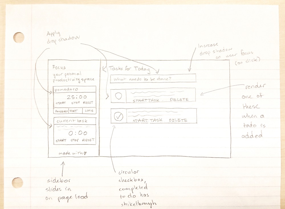
Rapid prototyping with rough sketches
Using the insights gathered in the user study, I brainstormed design solutions to seamlessly integrate time management techniques with a todo application. I drafted designs with pencil and paper to iterate upon ideas, incorporating a pomodoro timer along with a stopwatch to track the total time spent on a specific task. Each entry of the todo list needed to support actions to mark as done, reopen, start, edit, and delete.

Color Palette & Typeface
#e8516c
#4ab2dd
#9e9ecb
The color palette chosen for the app is both playful and bright, complementing the material design inspired UI. As the primary color for the app is red, the secondary colors simply serve as accents to distinguish adjacent buttons and are therefore not often used.
Instead of using Roboto as the typeface as per material design guidelines, I opted for the 'Prompt' typeface which is more rounded as a font, giving it a softer look. The material design inspired interface creates familiarity in new users while the color scheme and typeface both help give the application a friendly feel.
User Testing and Validation
Iteration from user feedback
After developing the V1 design shown earlier, I launched the application quietly to friends connected on social media, asking for feedback for the next iteration.
What users like:
• clean and simple interface
• one tool to track time and todos
• intuitive experience
What users don't like:
• text buttons which show for each todo
• unclear editing functionality (no button)
• new todos adding to the bottom of the list (reverse chronological order)
What users want to see:
• multiline todo functionality
• minimalistic todo entries
• reordering of todos
The feedback given was extremely valuable in validating what users like about the product, and determining the changes and features that need to be made. Through Google Analytics integration, I received validation of the product and execution, as the initial release secured many returning users. The first two of the features and all of the items in the second list have since been implemented and are live at focustodo.io.
Development
Ideation to deployment
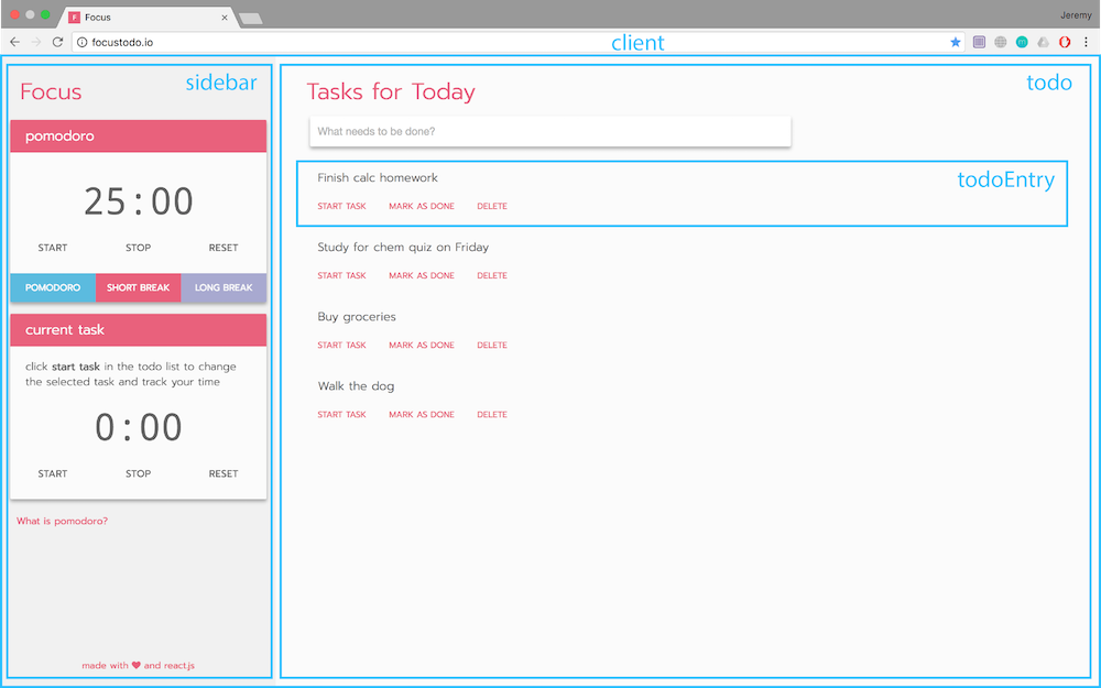
To develop the application, I used React to split Focus into several components. The component holding the entire app is 'Client', which then renders 'Sidebar' and 'Todo'. In turn, Todo renders 'TodoEntry' as the user adds entries to the list.
The todos are stored in the browser's local storage using an ID based map to ensure the user's todos persist on each visit. To onboard new users, a default configuration is shown when the user first visits the website, outlining tips and tricks for the application.
Next Steps
Plan the feature roadmap
Based on feedback received during user testing, I took note of features users wanted to see in future versions, such as the ability to group and reorder tasks. To further improve the user experience, I'll compare existing alternatives and todo list applications to add more tickets to the feature roadmap. As development is always ongoing, I'm excited to see the next iteration.